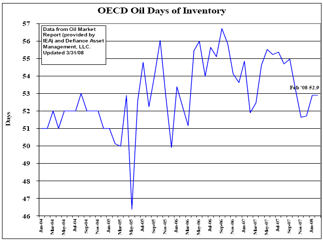
It's interesting to see that even though OIL prices have been in a steep uptrend since 2004, oil inventories have remained relatively FLAT worldwide. More specifically, while oil prices have increased 225% since January 2004 ($30.81/barrel!), days of global inventory/supply have only increased 4% (an increase of about 2 days worth of supplies to the market)!
The million dollar question should now be, WHY isn't new SUPPLY FLOODING the market when oil prices are over 200% higher than they were 4 years ago?? In a perfect world and per the economic textbooks we read in high school, oil producers should be doing all they can to churn out more supply and meet market demand at the VERY PROFITABLE $100/barrel level. I believe this graphs adds validity to the argument that higher energy prices are in the cards because crude oil is a long term supply problem (price activity is being driven by SCARCITY). Anyways, who knows why oil supply is currently constrained (...MAYBE the producers + OPEC are manipulating supply numbers and production activities to power the price higher? MAYBE its just huge demand from India and China...), BOTTOM LINE is that it looks like the long term trend in prices remains HIGHER until either WW demand DRAMATICALLY slows down or WW supply (as measured by the days of oil inventory) DRAMATICALLY increases.
As a long term energy investor I remain excited about the possibility of higher trending prices...as a lowly consumer though I'm a little bit worried about the ramifications..
*Graph on recent Oil Supply (Inventories):
http://images.thestreet.com/tsc/common/images/storyimages/033108_cod.gif

*Graph on recent Oil Prices:
http://upload.wikimedia.org/wikipedia/en/a/ad/Oil_Prices_Medium_Term.jpg

http://upload.wikimedia.org/wikipedia/en/a/ad/Oil_Prices_Medium_Term.jpg

Data Courtesy: Wikipedia + TheStreet.com


